

Why Professional Designers Always Prioritize Light Temperature First
When stepping into a beautifully designed space, you may not realize that what makes it feel just right isn’t the furniture, color palette, or accessories; it’s the lighting. More specifically, the temperature of the light. For professional designers, this detail isn’t an afterthought; it’s a foundational element.
What Is Light Temperature?
Light temperature refers to the color tone of the light in a space, ranging from warm (soft yellow/orange hues) to cool (bright white or bluish tones). It’s measured in Kelvins (K), and it dramatically impacts the mood of a room. Think of the cozy glow of a candle-lit dinner versus the bright intensity of an operating room, both purposeful, but with entirely different emotional effects.
Why It Matters in Design
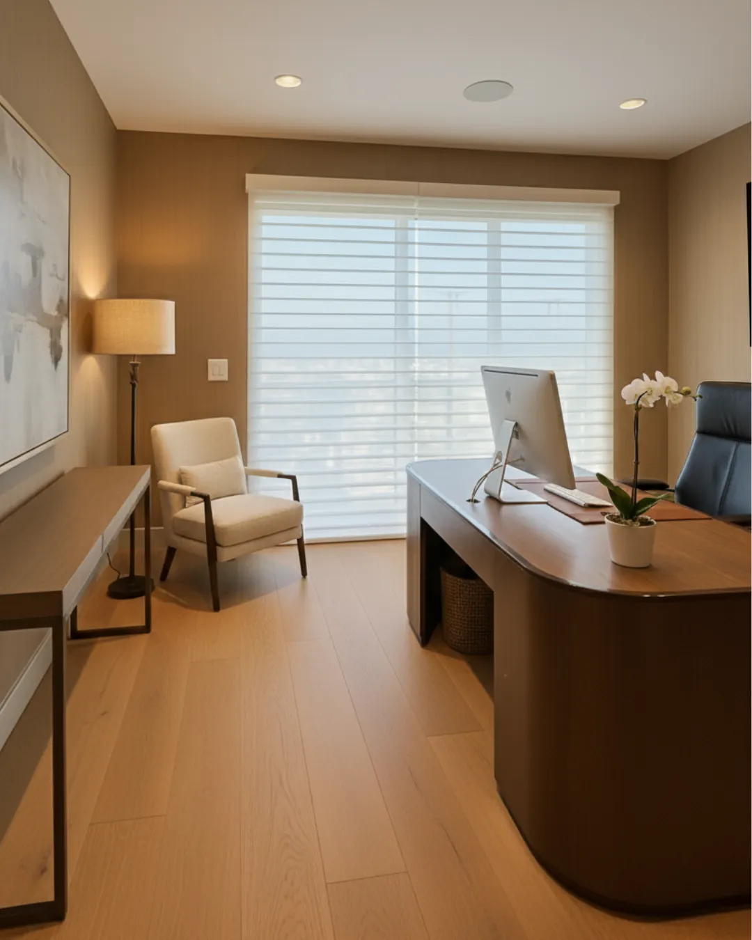
Designers know that even the most stunning room can feel off if the lighting isn’t aligned with the space’s function or vibe. Warm light (2700K–3000K) is ideal for living rooms and bedrooms because it creates a relaxing, inviting atmosphere. Cooler light (4000K–5000K) works better in kitchens, bathrooms, or workspaces where clarity and energy are needed.
When selecting window treatments, professionals choose fabrics that interact harmoniously with existing light temperatures. Sheers, natural textures, and layered treatments are often used to filter or diffuse light in a way that complements the design, not competes with it.
Light Before Layers
Before choosing a rug or paint swatch, seasoned designers will stand back and observe how light behaves in your space throughout the day. That’s how they ensure that every finish, fabric, and detail works in harmony, not just under showroom conditions, but in real life.
Want a home that looks and feels just right? Let’s start with how the light lives in your space and design from there. Reach out for a consultation, and let’s set the perfect tone together.
Until next time,
Grace

Why Professional Designers Always Prioritize Light Temperature First
When stepping into a beautifully designed space, you may not realize that what makes it feel just right isn’t the furniture, color palette, or accessories; it’s the lighting. More specifically, the temperature of the light. For professional designers, this detail isn’t an afterthought; it’s a foundational element.
What Is Light Temperature?
Light temperature refers to the color tone of the light in a space, ranging from warm (soft yellow/orange hues) to cool (bright white or bluish tones). It’s measured in Kelvins (K), and it dramatically impacts the mood of a room. Think of the cozy glow of a candle-lit dinner versus the bright intensity of an operating room, both purposeful, but with entirely different emotional effects.
Why It Matters in Design
Designers know that even the most stunning room can feel off if the lighting isn’t aligned with the space’s function or vibe. Warm light (2700K–3000K) is ideal for living rooms and bedrooms because it creates a relaxing, inviting atmosphere. Cooler light (4000K–5000K) works better in kitchens, bathrooms, or workspaces where clarity and energy are needed.
When selecting window treatments, professionals choose fabrics that interact harmoniously with existing light temperatures. Sheers, natural textures, and layered treatments are often used to filter or diffuse light in a way that complements the design, not competes with it.
Light Before Layers
Before choosing a rug or paint swatch, seasoned designers will stand back and observe how light behaves in your space throughout the day. That’s how they ensure that every finish, fabric, and detail works in harmony, not just under showroom conditions, but in real life.
Want a home that looks and feels just right? Let’s start with how the light lives in your space and design from there. Reach out for a consultation, and let’s set the perfect tone together.
Until next time,
Grace